I like CSS, and if there is a way to things with CSS, I’m all about it.
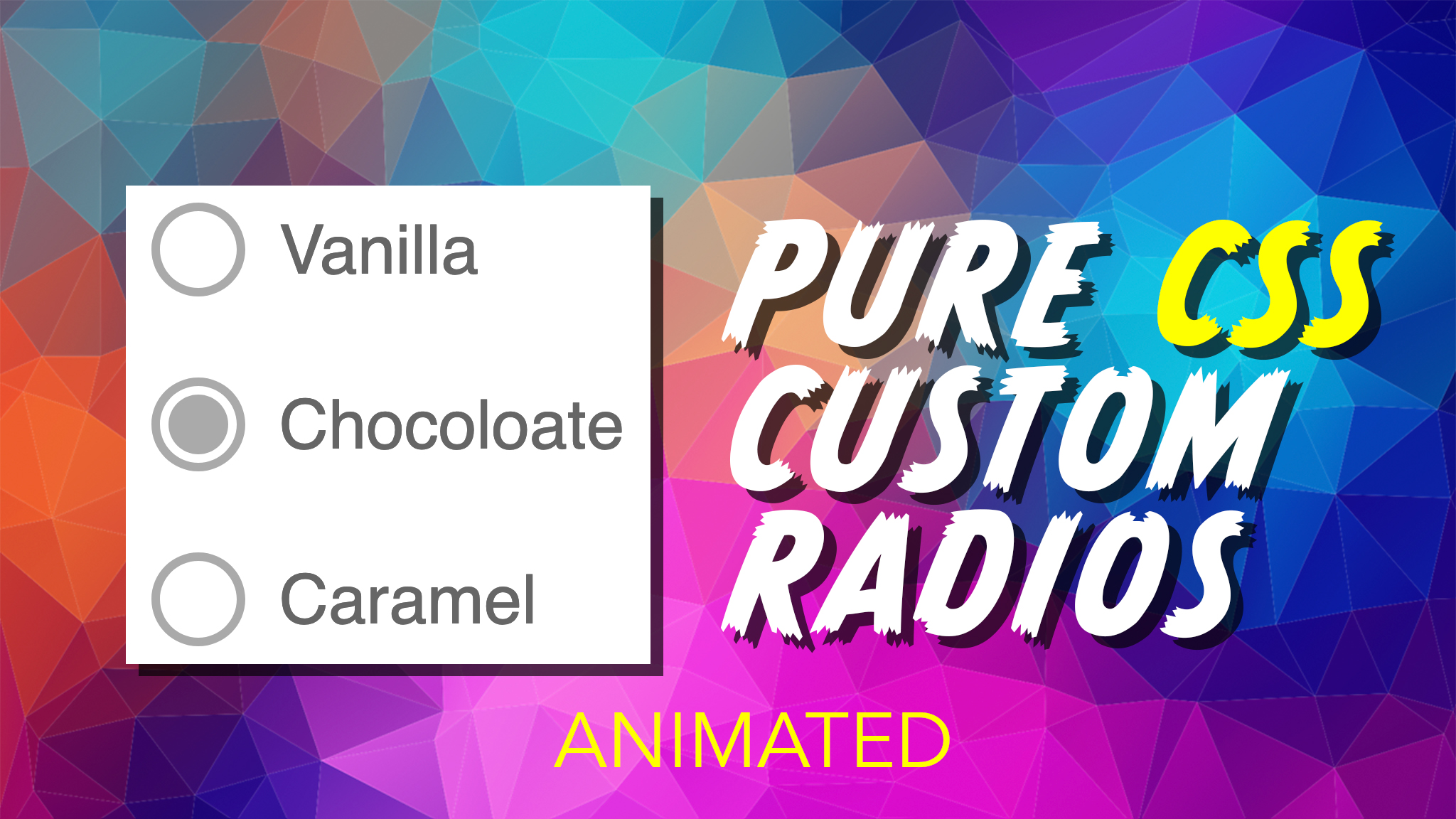
One thing that’s been notoriously difficult (and still is in 2020) is styling web forms. They behave and look quite differently between web browsers and CSS support for styling isn’t great. As such, in this tutorial we’ll be creating, stying, and animating custom radio buttons using a few tricks!
There are essentially three main tricks to get this to work:
- Hide the default radio buttons completely
- Source the radio button labels to be after the inputs
- Style the radio labels using before & after css pseudo elements
Hide The Radios
There are a couple of ways to do this (each with some with some accessibility issues)
- Position it out of bounds: left: -9999px
- Use display: none
- Use visibility: hidden
- Use opacity: 0
[type="radio"]{
    opacity:0;
}
Inputs After Labels
This step is important, as it will allow us to use the CSS “+” Adjacent selector to determine clicked stated
<input type="radio" id="vanilla" name="ice-cream" >
<label for="vanilla">Vanilla</label>
Style The Radios
Technically, we’re stying the labels as we’ve hidden the actual radios. We’ll be using:
- Before & after pseudo elements
- + Adjacent selector for click
- :checked (and not()) pseudo selector
[type="radio"] + label{
    position:relative;
    padding-left:30px;
    cursor:pointer;
    display:inline-block;
    color:#666;
    line-height:25px;
}

[type="radio"] + label::before{
    content:"";
    position:absolute;
    left:0;
    top:0;
    width:18px;
    height:18px;
    border-radius: 100%;
    border:2px solid #aaa;
    background:#fff;

}

[type="radio"]:checked + label::after{
    content:"";
    position:absolute;
    left:4px;
    top:4px;
    width:14px;
    height:14px;
    border-radius:100%;
    background:#aaa;
    transform:scale(1);
    opacity:1;
    transition:all .3s ease;
}

[type="radio"]:not(:checked) + label::after{
    content:"";
    position:absolute;
    left:4px;
    top:4px;
    width:14px;
    height:14px;
    border-radius:100%;
    background:#fff;
    transform:scale(0);
    opacity:0;
}
}