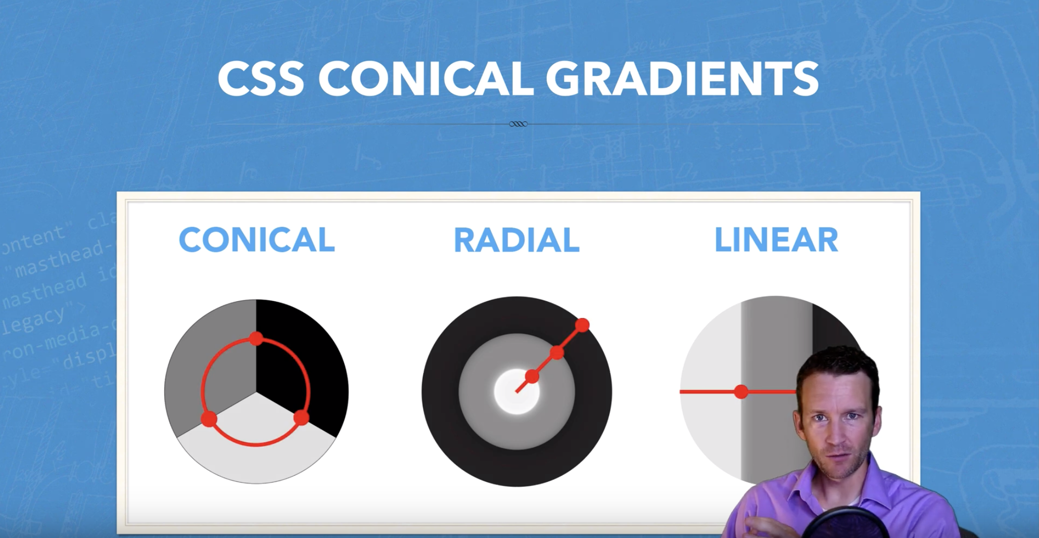
Did you know that CSS now (largely — see support) has support for conical gradients in addition to the standard linear and radial? If this if your first time hearing the word conical, then this tutorial is for you! Visual learners: Watch the youtube video tutorial (subscribe to the channel!):
What Are Conical Gradients?

Canonical gradients get their name from the ‘cone’ shape that they visually create. A picture is worth a thousand words here. Canonical gradients wrap around the outer bounds of the area, instead of slicing through the center like so:
Conical Gradient Syntax
You can create conical gradients with a similar syntax to linear gradients like so:
background: conic-gradient(red, orange, yellow, green, blue);Units of Measure
One important thing to keep in mind, is that because Conical gradients use an ‘angle’ as values, we have atypical css unit types that we can leverage. Here is a list of the available units you can use with these gradients:
- deg – Degrees (360 degrees)
- grad – Gradians (400 gradians)
- rad – Radians (2π radians)
- turn – Turns (1 turn)
- % – Percentage (100%)
A Few Samples:
Note, if your browser doesn’t support conic gradients, (cough Firefox) you can use this awesome polyfill.
Sunburst Background via Repeating Gradient
div{
background: #0ac repeating-conic-gradient(hsla(0,0%,100%,.2) 0 15deg, hsla(0,0%,100%,0) 0 30deg);
}
Pie Charts Anyone?
note these aren’t great for accessibility
div{
    background: conic-gradient(
     red 48deg, green 48deg 195deg, blue 195deg);
    border-radius: 50%
}
Checkerboard Pattern (fancy ‘transparent’ layer effect)
div{
    background:
    conic-gradient(#fff 0.25turn, #bbb 0.25turn 0.5turn, #fff 0.5turn 0.75turn, #bbb 0.75turn)
    top left / 10% 10% repeat;
    outline: 1px solid;
}
True “Cone”-ic Gradient
#five{
    background: conic-gradient(from -28deg, white,black 180deg,white);
    border-radius:50%;
    transition:all .5s;
    transform:rotate(0deg);
}

